Enrollment Dashboard
This project involved transforming a time-consuming, paper enrollment process into an efficient online experience. It's crucial to enroll disabled clients and their caregivers as quickly as possible, so people can get the care they need. In addition, Public Partnerships' revenue is based on the volume of caregiver service hours.
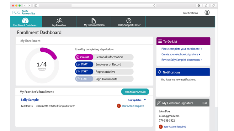
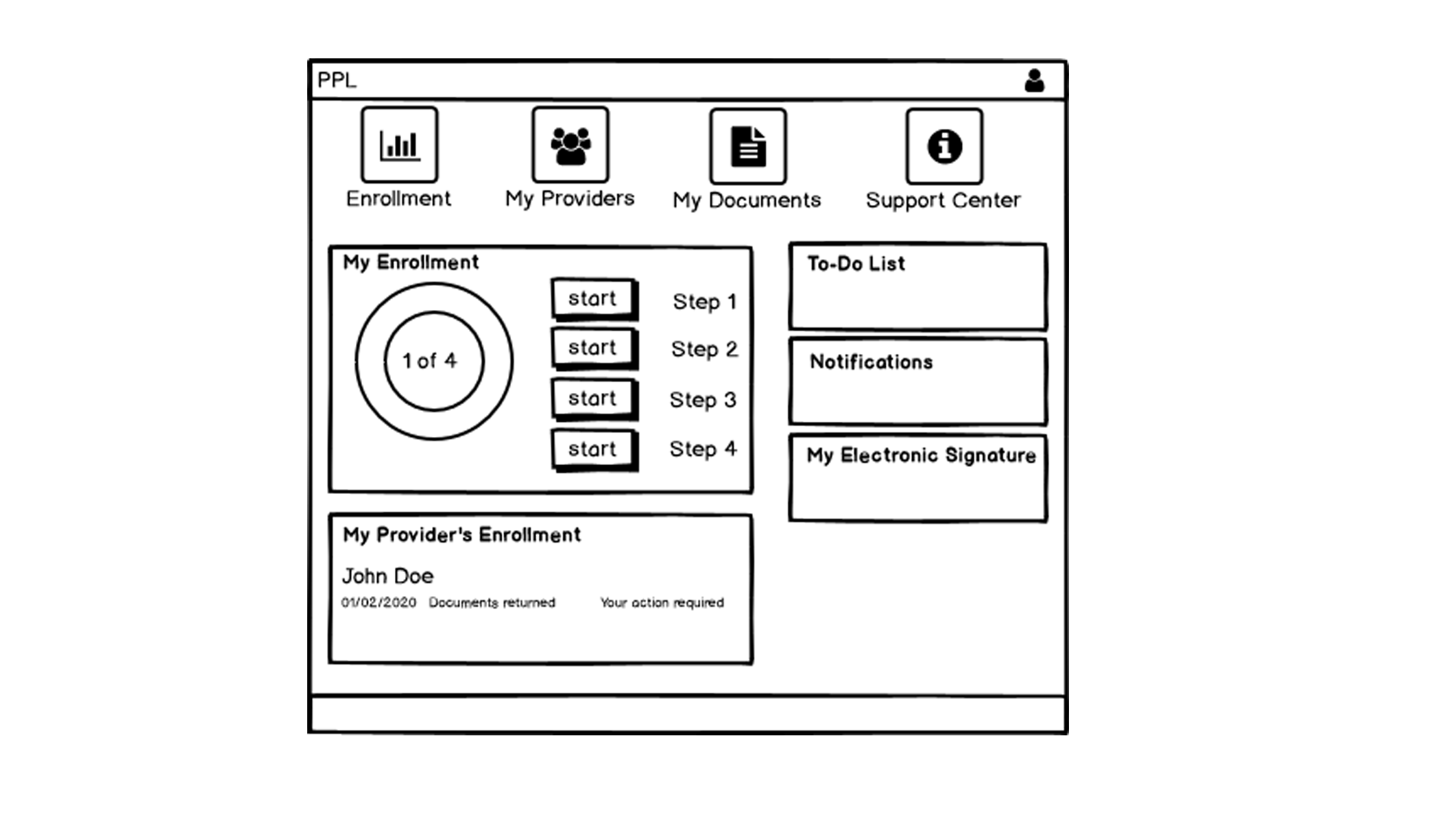
I created low-fidelity designs for ease of understanding, and to help guide caregivers and disabled clients through the enrollment process. I also
designed low-fidelity designs for an administration dashboard, to help administrators track the enrollment process.
Preliminary designs

My Role
I was the sole user experience and interface designer for the project. I gathered information from the business and enrollment teams, and created user-centered design to help achieve business goals. I conceived of specific ways to help clients complete their tasks with ease, including alerts and action items so they could understand next steps. Throughout the process, I presented design solutions to the teams, and collaborated to refine and enhance the product and add functionality.
Customer Insights & Ideation
I partnered with business managers and enrollment leaders to understand the team needs and requirements. I was the lead designer to draw these ideas, to help translate their concepts into actual designs.
User Experience Strategy & Vision
We set out to overhaul a process that was highly frustrating to users and cumbersome for administrators. Our driving strategy was to keep this new product simple and effective for users, and to help guide them through enrollment. I wanted to make this a great experience for the clients, visually pleasing, and solve a big roadblock in our business.
Planning & Scope Definition
I created this site with an eye to rolling it out to one client group, and to be able to expand it to others later, with feedback and tweaking.
Approach
Time4Care Balsamiq Drawings
This is a Balsamiq drawing of the main enrollment page for disabled clients. It's a first step towards a low-fidelity design, for early feedback. It organized the content, using a visual hierarchy to indicate importance of tasks.
Sketch
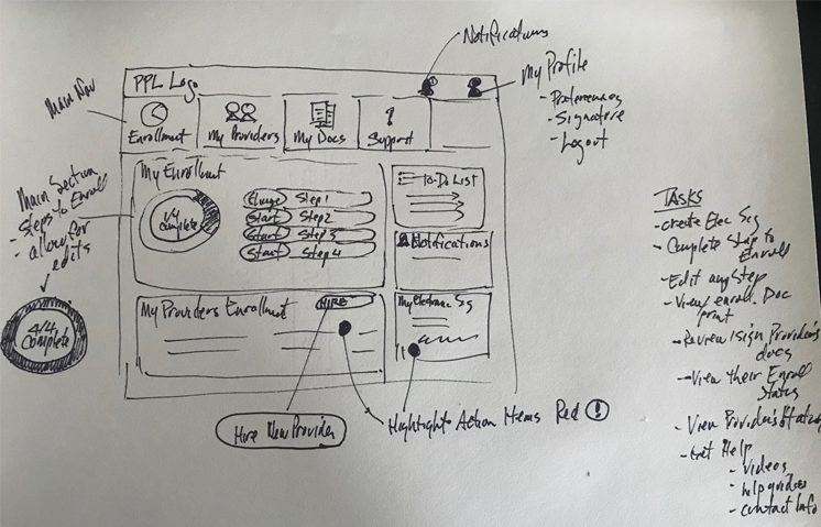
Example of Early Sketch of Enrollment Screen
I do many of these sketches at the beginning of a project, to get my thoughts and ideas down. Once I'm satisfied and have a strong grasp of the ideas on paper, I create Balsamiq mockups or low-fidelity designs to present to the team and get feedback. I continue to tweak and improve until the team signs off. This design work helps the business team write functionality and design requirements to pass to the IT team.
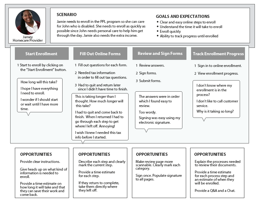
Journey Map
Journey Map of a Care Provider
We interviewed a few providers and explained our project. We showed some preliminary wireframes and gathered feedback. I created a journey map to help explain the pain points and frustrations to the team.
Low-Fidelity Mockups
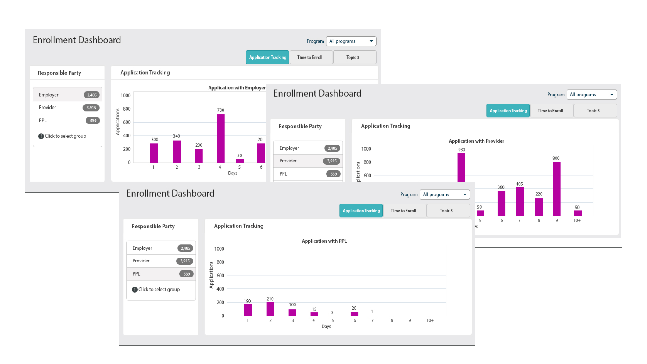
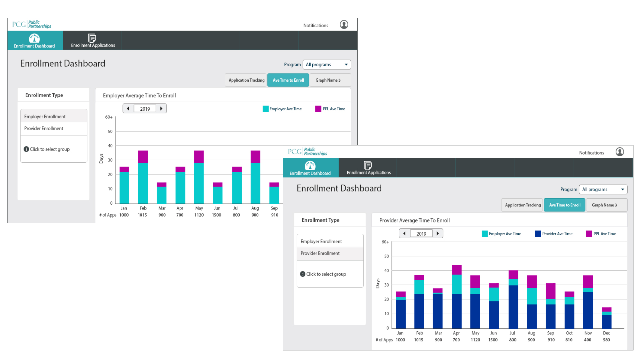
Online Enrollment for Administrators
After Balsamiq drawings are approved, I created low-fidelity images. Here, I added visual elements, color, style of buttons, wording, and fine-tuning of the layout. All of this comes before the high-fidelity images.
These charts show administrators where enrollments are in the process, to track progress and identify any bottlenecks they need to address.