Budget Calculator
We set out to solve a critical problem for disabled clients with this tool. From customer feedback, we learned that people were struggling to keep track of their budgets for hiring caregivers. Some would even go without services, afraid of spending more than their allotted state funds. I led the design of the Budget Calculator tool to address this challenge.
Online Tool

My Role
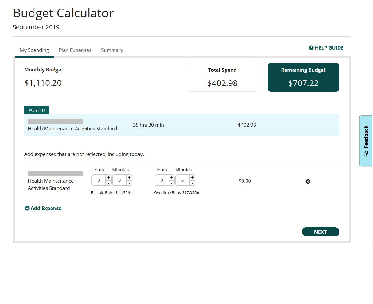
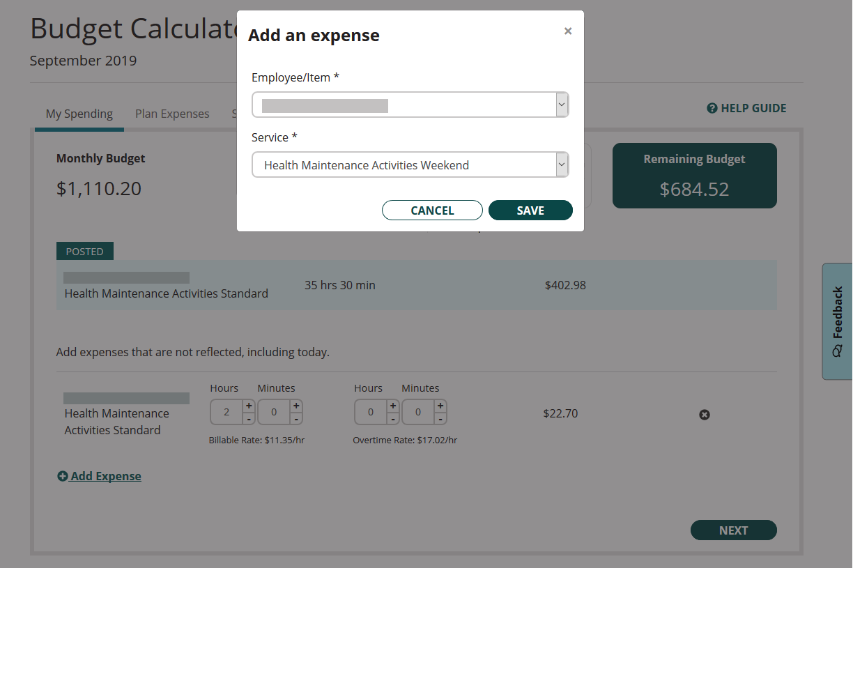
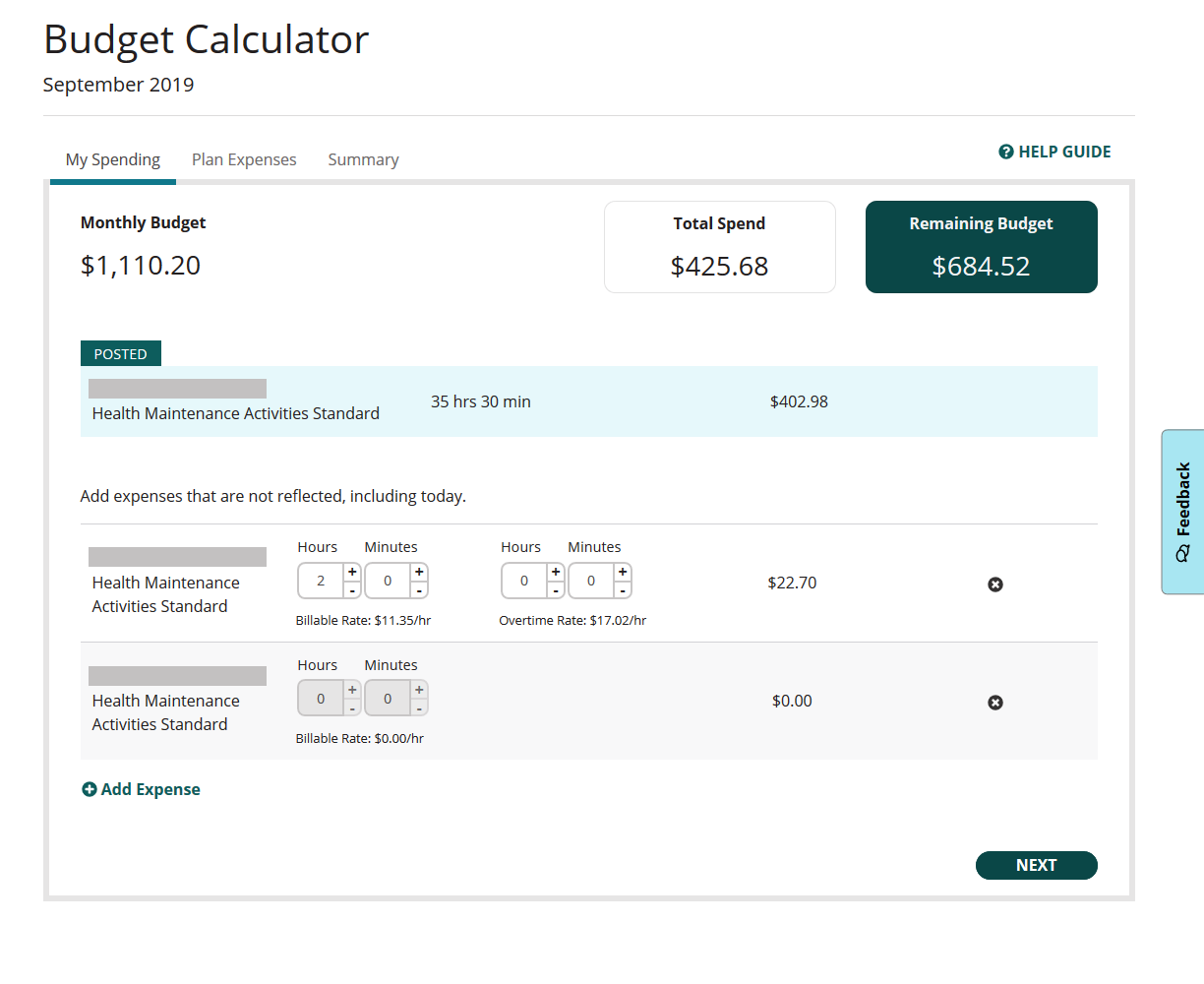
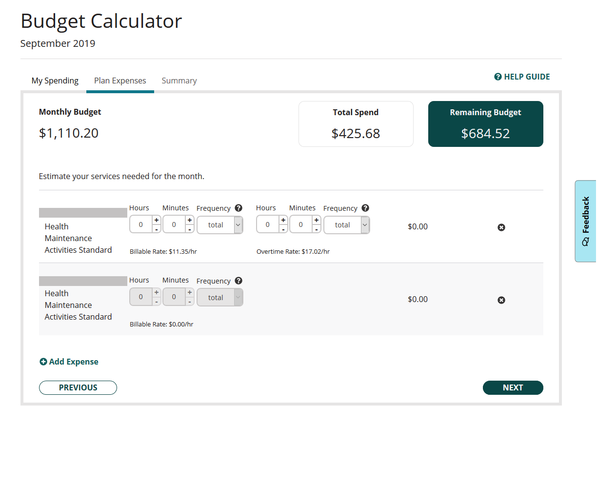
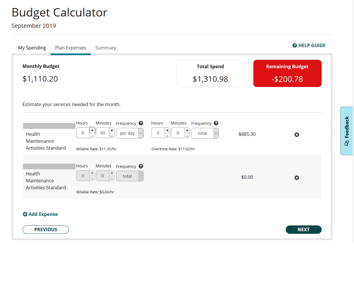
I led UX/UI design and suggested using a tab/wizard approach that guides the user through each step. We wanted to keep this simple and not overwhelm the user with numbers and math on the screen. We built this with a feature that lets users easily adjust spending and services to know what they can afford. In particular, we kept a running tally of their remaining monthly dollars to spend as a prominent feature on the page. And we made it obvious if they were at risk of overspending.

Customer Insights & Ideation
I worked with the business team to understand the problem disabled users were facing, and set out to create a tool that would both help meet their service needs and accurately track their spending. This would also enhance our company's revenue by helping users book all the services available within their budgets.
User Experience Strategy & Vision
I drew out and pitched two different design concepts to the team, one that put all the math on one page, and one using more of a wizard approach. There were pros and cons to each, but I felt the one-pager was too overwhelming for our type of customers. The team agreed, and we opted for simplicity, with a step-by-step approach. I wanted to make this very easy for the users, so they could feel comfortable using the tool, and trust that it was reliable.
Oversight & Coordination
I oversaw development and tested for usability over the course of the project. We used agile methods to build the product, and I provided design and usability expertise throughout.
Sketch
Approach
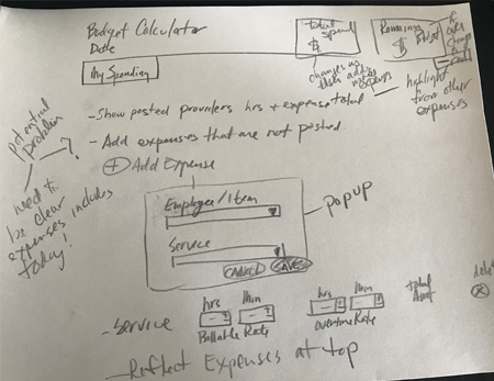
Example of Early Sketches
I do many initial sketches to get ideas on paper.
Early Sketch of Spending Tab
Here, I sketched out ideas for content, including what information should be shown to the user, and what tasks they could do. In this sketch I also noted potential problems the user could encounter -- design details I needed to resolve.
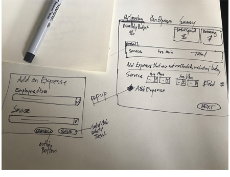
Sketch 2, Spending Tab
In later sketches, I fine-tuned design, approach and wording.
Feedback Feature
We wanted to continually get feedback from our users to improve our budget tool. This enabled us to enhance design and update any features.
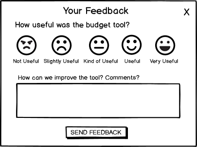
Balsamiq Drawing of Feedback Popup
I designed this so we could get useful information, making it easy for users to tell us how they found this tool to work.
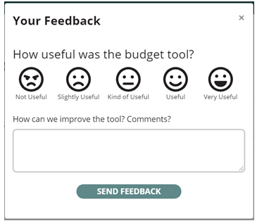
Current Feedback Popup Design
This is the actual design. It's very simple, aimed at getting quick and easy feedback from users. It was important for us to encourage feedback, so users would provide it.