Time4Care App
Designed mobile app for caregivers and disabled clients, providing both improved efficiency and accuracy in tracking hours of care and pay.
Mobile App
My Role
I led the UX/UI design of Time4Care, from conception and collaboration with the business team and developers to the launch. I designed the flow and visuals, and oversaw execution as well as ongoing updates for new features and requirements.
Challenges
Had to develop approach to bridge gap between design and development in outdated system environment. Created user-centered design, while overcoming significant back-end system obstacles.
Another challenge was accomodating the varied requirements of different state clients. Designed product to meet these needs without overwhelming or complicating user experience.
Responded to major shift in government requirements in the way caregivers record time. I incorporated new design into Time4Care app, including both original timesheet model and new 'clocking in' and 'out' of work shifts.
Insights & Ideation
I partnered with business managers to discover needs and translate concepts into features that address customer behaviors and motivations.
User Experience Strategy & Vision
I created designs, layouts and prototypes to share vision, design principles and content strategy. This helped to crystallize ideas and drive decision making.
Oversight & Coordination
I oversaw development, to fine-tune design, functionality and flow. Communicated with buiness team throughout the process.
Notifications
Incorporated notifications between caregivers and disabled people, making their communications more immediate. This also enabled timely and accurate tracking of services paid for by the state.
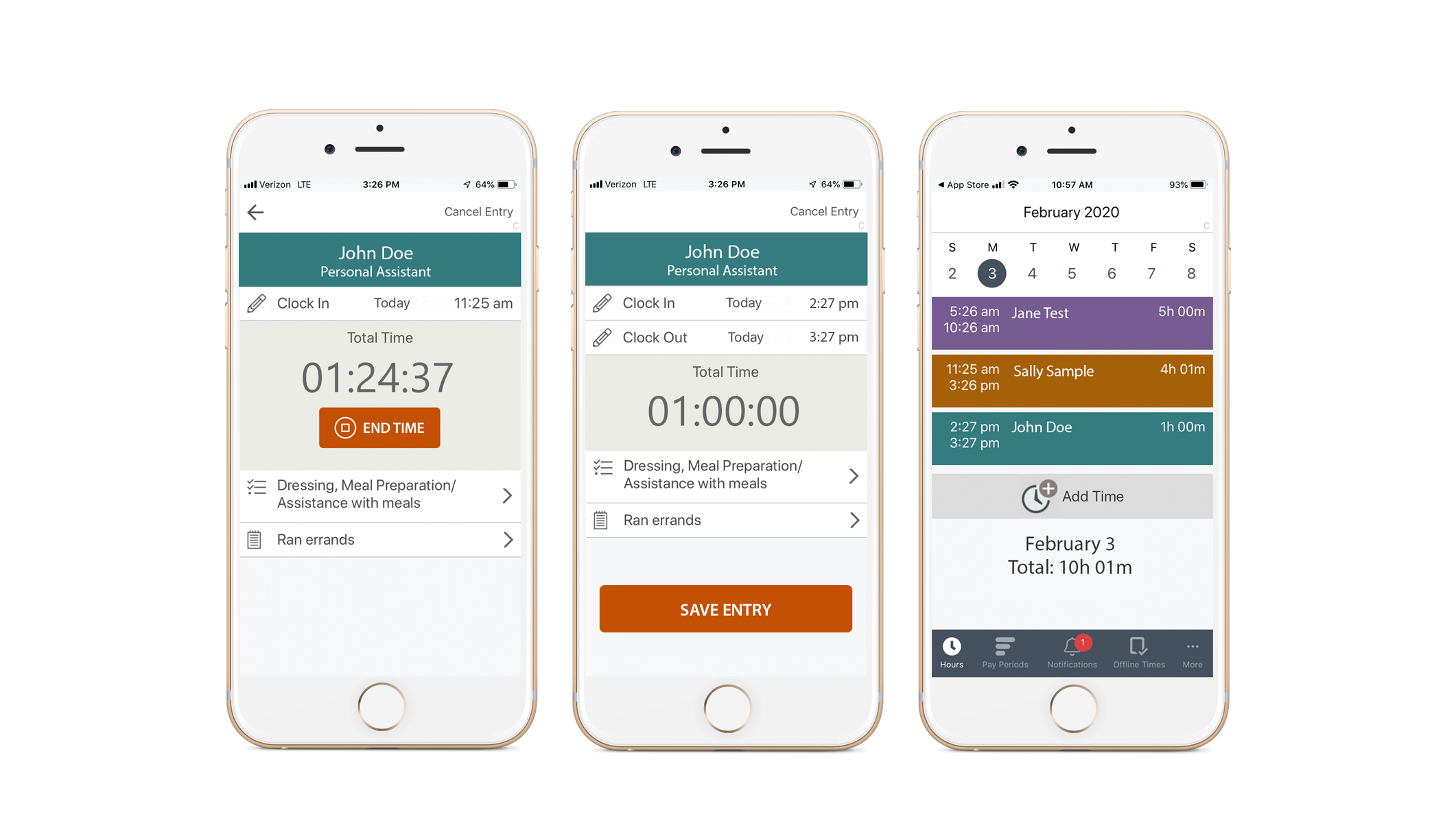
Key screens from Time4Care app. The caregiver can clock in, select activites and add notes about their visit before they clock out. A notification is sent to the client, who can immediately approve completion of service. All visits are chronicled in a calendar-based design.
Approach
Time4Care Balsamiq Drawings
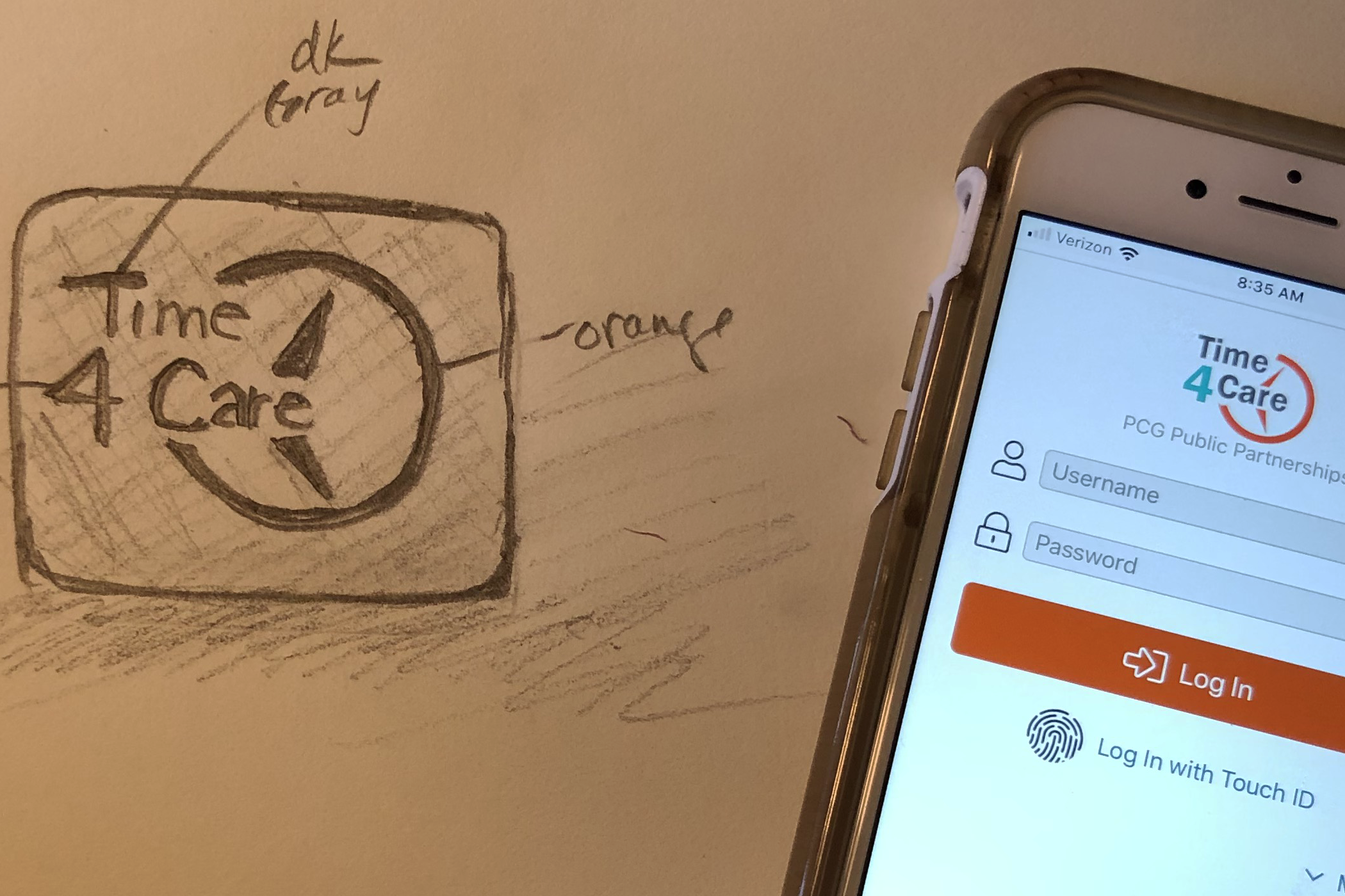
My sketches dominate the early ideation stages. The Balsamiq drawings help fine-tune design before low-fidelity images. I produce many ideas, then select and narrow them, repeating that process to find the right design.
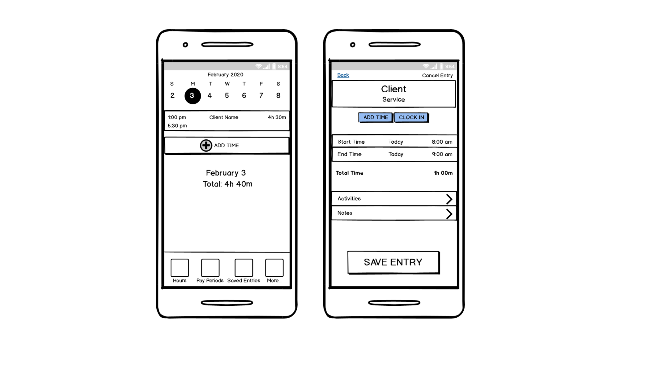
Early Sketches
Often words alone cannot communicate a behavior. Sketching out flow helps to plan navigation and how the user can complete their tasks. I like to sketch to quickly develop design ideas and flow.
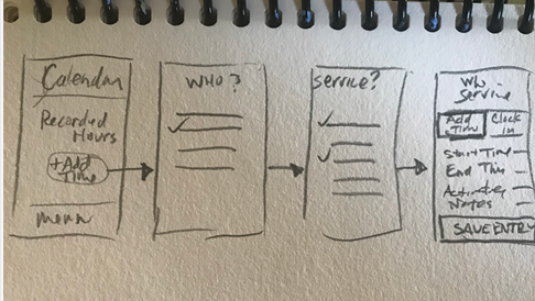
Sketch to Illustrate Flow
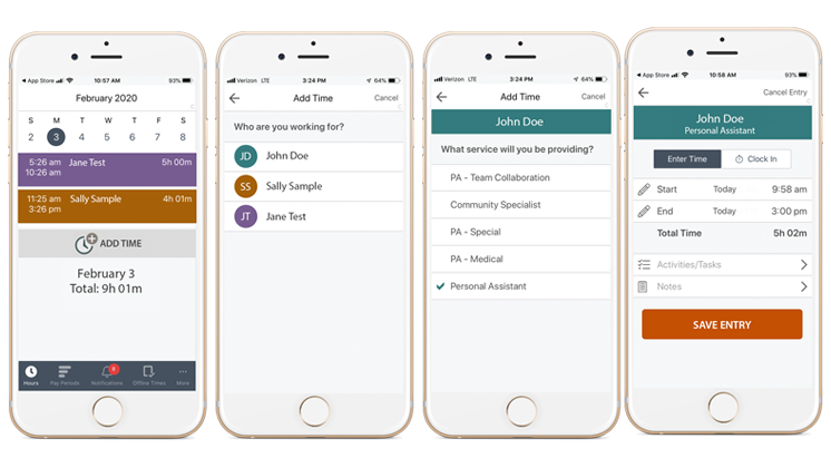
When a picture is required, I illustrate flow using sketches and/or protoypes. In this case, I illustrated the initial stages of how to add time to a timesheet. This sketch shows how a caregiver goes from a calendar day to recording a client visit and details.
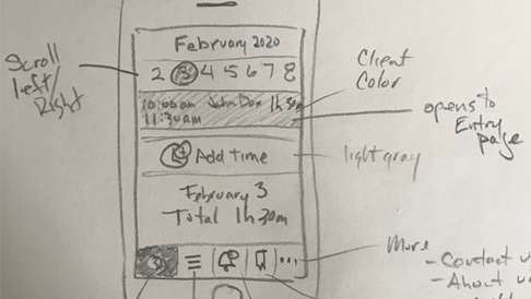
UI Sketch
This sketch shows the calendar page of the app. It's a quick illustration of a key screen, essentially the landing page, showing the day's recorded visits. This is where I start to envision color and layout.
Flow Mockup
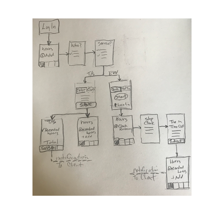
Sketch of main flow of 2 models: Timesheet model and EVV
This flow demonstrates how we'd tackle new government requirements to record caregivers' time through Electronic Visit Verification (EVV). This shows how the app would accommodate our original time-tracking model and the new EVV approach.
